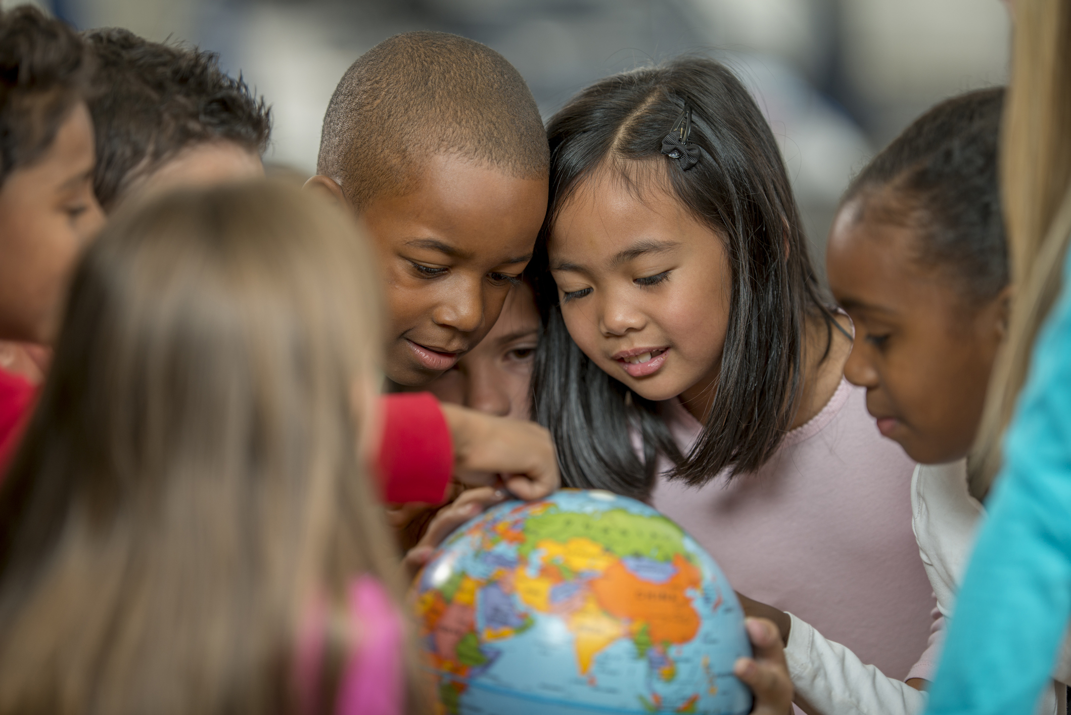
Since last Sunday, the world has taken part in Geography Awareness Week.
For our part, this got us pondering: how accurate is Earth depicted in the maps we use? And why is this relevant?
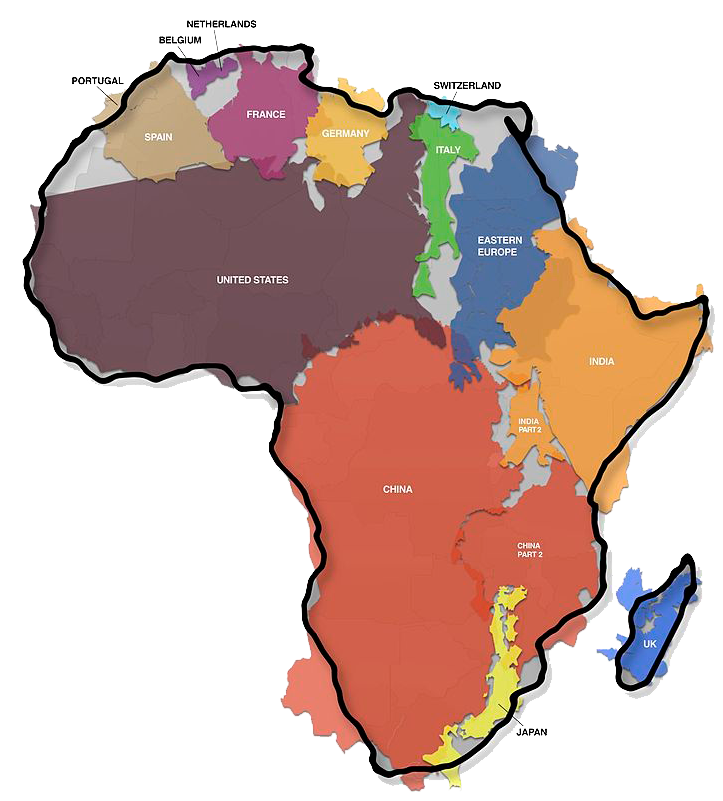
The vast majority of us have seen a world map and probably have a pretty clear image of it in mind. In fact, that image is most likely inaccurate in terms of proportions. The most widespread representation of our world is one that was introduced in the 1500s, called the Mercator Projection. It was ground-breaking at the time, as it offered navigators a new way of plotting courses and calculating distances in a way that was much more accessible than ever before. However, these maps were designed for commercial purposes at the height of colonisation. This came with the price of distorting the size of continents and countries, making Africa seem the same size as Greenland, when in fact it is 14 times larger than it.

This made us reflect on how we are taught to view the world. Does this misrepresentation affect our perception of different communities, the events happening there, or even those who live there?
Nowadays, a number of other projections exist that aim to more accurately portray the world we live in. The most accurate depiction so far was produced in 1999 by architect Hajime Narukawa and it is called the AuthaGraph projection.
Traditional maps are useful for navigation purposes and we’re not trying to minimise their importance. However, we believe that new representations should be taken into consideration for use in classrooms and encourage us towards viewing the world as a global community. A more accurate view of the scale of the world might help us combat some notions of inequality and perceived importance.
Only through a fair and accurate representation within a system can its members truly be equal.


